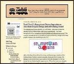

Following my attendance at Clown School in the spring of 2009, and a great experience as part of the Amtrak Cascades Character Clown Corps for the Portland Rose Festival, my clown pal Pippa (aka educator Debra Samuel) suggested that those interested in clowning around a bit more participate in the 2009 Portland Pride Parade. As the event was not an official Rose Festival event we would need to march under a new clown troupe moniker. Pippa came up with the name "Stumptown Clowns."
In my odd logo designer mind, as soon as I was made aware of the name, I literally saw the words visually as a potential clown face. The "U" letterform in the word "Stumptown" could become a winking eye, with the "O" in the term creating another eye that was wide open. It only made sense that the "O" in "Clown" would become a big red clown nose. With the suggestion that the Stumptown Clowns needed an identifying sign for the parade, the logo design became a reality.
The typeface Blue Plate Special, from Nick's Fonts, gave the design the circus/carnival quality I desired.

The Sentinel is not your ordinary neighborhood newspaper, and publisher Cornelius Swart did not want your everyday newspaper identity when it came time to rebrand the publication. Swart and his staff narrowed my initial type selection presentations to Boca Raton Solid and Rockwell Extra Bold treatments. They liked the "sexiness" of Boca Raton, but thought it might be a little too "magazine-like." Those providing input felt that Rockwell conveyed the "seriousness" needed for a newspaper, but the uppercase "S" letterform was too heavy, "clunky" and distracting. I was asked to finesse - or change - the "S" in the Rockwell treatment, to tweak the eye imagery, and play with "i" letterform a bit to make it possibly more lighthouse or "sentinel-like."
In literally going back to the drawing table, I worked on the "S" element for quite some time. I kept returning to the fact that everyone involved liked the "S" letterform from the Boca Raton font a great deal. In what was a bit of an "a-ha" moment I simply took the "S" from Boca Raton and dropped it in front of the Rockwell treatment of the remaining letters in the word "Sentinel." It seemed to work beautifully - and the newspaper crew agreed.
With a little finessing of the implied lighthouse image, and it's "every vigilant" eye, the paper had a strong and unique identity. The design appears in the book American Graphic Design & Advertising 25

When approached by the publishing business Buttonberry Books to create a fun identity, I took the challenge literally. As is often the case, I immediately saw the visuals of a berry and buttons taking shape as graphic elements within the design to represent the company. The type Carnation, from Fonthead Designs, added the element of playfulness.
The Buttonberry Books identity appears in the books New Logo World (Japan), Logo Design for Small Business 2, and Logos from North to South America (Spain).

The Central Oregon town of Sisters, where my family's had a home for over 30 years, has hosted the annual Sisters Rodeo for over over six decades. It was an honor to be asked to design the event's first official logo for the 60th anniversary and I wanted to create an image that could be perceived as possibly being the identity since the 1940's.
From the beginning of the project I had no doubt the symbol representing this live-action piece of Western Americana would end up being red, white and blue in color. The flags, banners, music and patriotism associated with the rodeo immediately dictated that color palette. I also knew that I wanted a cowboy on a bucking bronco, or bull, as the primary element. Having seen many a cowboy hat fly through the air at previous rodeos, I felt graphically representing the hat would add a little implied movement - and my own little brand of humor - to the logo. The cowboy graphic fit well into the "O" of an original concept scribble, and the airborne cowboy hat became the dot of the "i" letterform in the word "Sisters," as the symbol almost designed itself.
Horndon gave the image the typographic period feel I was seeking. Customizing type elements, around the "O" shape and on the descender of the "R," added to making a one-of-a-kind logo.
This identity was included when the Sisters Rodeo was inducted into the Library of Congress “Local Legacies" archive. The rodeo logo received an Award of Merit in the Central Oregon Drake Awards and a Silver in the Summit Creative Awards. It also is featured in The Big Book of Logos 3, LogoLounge - Volume 1 and Design for Special Events

One of my personal favorites has always been the logo I designed for the Seattle breakfast establishment Glo's Broiler. It's a good example of a well thought out concept coming together with a "happy accident" to produce a strong identifying image. In designing the logo, I knew I wanted a coffee cup and plate to represent the "o" letterforms in the name. Then, as I rotated the coffee cup illustration a bit, a lower-case "g" appeared within the design.
The same treatment then worked in a secondary image for the restaurant. The owner wanted to have a complimentary logo to represent the athletic teams the eatery sponsored and the "Glo's Boys" imagery was the second "happy accident" in the branding process.
The Glo's Broiler image appears in the books Bullet-Proof Logos, Logo Design for Small Business 2, the Japanese volume New Logo and Trademark Design (which was recently re-released as the paperback Logo and Trademark Collection) and 1000 Restaurant, Bar, and Cafe Graphics.

While archiving logo design work I have done over the past 30 years, I've been coming across many other projects where I have used graphic elements as substitutes for letterforms with a variety of results. One of the earliest successes was the logo design for hairstylist Jeff Maul. By just taking the time to look at hair-cutting scissors in a different way, I was able to see possible letter shapes in the holes used for fingers.

The St. Johns Window Project is a local event where North Portland artists are asked to create works of art to be displayed in the windows of area businesses. When asked to create a logo for the annual event, I immediately visualized window frames as replacements for letters in the name - before the organization's contact could even finish explaining what they hoped for in an identity. The effort received a 2003 American Graphic Design Award from Graphic Design: usa magazine.

Personal chef and caterer Jim Crabtree wanted a simple and distinctive identity for his business. In researching catering logo images, I kept coming across graphic representations of dinner plates, waiters, picnic baskets, fruits and vegetables, serving trays, bottles of wine, and other fairly common items. None of the examples gave me the impression of being unique to the industry. Jim himself was one of the most unique aspects of his business - with his spiky hair and angular features. That's when I realized a "W," the first letter in his company name, could easily be adapted to represent a portion of a man's body. The final design resulted in many of the owner's friends and clients saying "it looks just like him."
The "What's For Dinner?" logo is also featured in the Logo Design for Small Business 2, New Logo and Trademark Design and Logo and Trademark Collection.

One fairly recent example of replacing type with graphic elements is the identity I created for a friend's startup interior design business, NoBox Design. In explaining her plans for the business, the friend told me that the name referred to the fact she didn't want clients thinking "out of the box;" she wanted them to realize that there was "no box" when it came to conceptulizing interior spaces. I immediately thought of round forms, especially the rounded shapes of a 1980's Donghia chair. Back in 1984 I produced a set of two silkscreen prints making use of a Donghia-like over-stuffed chair - one of my favorite furniture shapes. (The prints were sold in Portland galleries and made an appearance as set decoration on the soap Days of Our Lives.)
The two "O" letterforms in the word "NoBox" were prefectly placed to become the round arms of the chair illustration. With my friend's first name beginning with the letter "B," I felt a stylized graphic representation of a monogrammed throw, of blanket, made an appropriate centerpiece in the design.
This past year the NoBox Design logo was recognized with a 2006 American Corporate Identity Award and it appears in the book American Corporate Identity 2007.

The identity for Black Dog Furniture Design is one of my favorite logo projects. Brett Bigham, commonly known as my "evil devil pig friend from hell," provided me with a piece of paper covered with a collection of puppy footprint drawings and sketches of his little black dog, Adobo. He wanted me to create an identity for his startup furniture business of creating new pieces from found objects and old furniture. The font Very Merry, from Fonthead Design, was my first choice to compliment the primative quality of the dog illustration. For me, replacing the letter "o" with the tail "wag marks" was a natural consideration in making the logo unusual.
From the perspective of being recognized in the design industry, the Black Dog Furniture Design logo has been one of my most successful. The logo appears in the books The Big Book of Logos 3, Letterhead and Logo Design 7, Graphically Speaking, American Corporate Identity 2003, Global Corporate Identity, PRINT's Regional Design Annual, Logo Design for Small Business 2,LogoLounge Master Library, Volume 2:
3000 Animal and Mythology Logos and Graphis Logo 6. It also received an American Graphic Design Award from Graphic Design: usa magazine.

Over the past 16 years I've designed over 100 logos for the triangle productions! theatre company in Portland. Many have involved combining graphics and type to produce a concise and unique graphic symbol. Creating the logo for the theatrical production The Dream State was such a case. In playing with the shape of the letters on my computer screen I saw that star shapes would work to replace the "A" letterforms in the words "dream" and "state." I tried a couple different fonts in making the image light and playful; settling on Circus Dog, also from Fonthead. The crescent moon image was added as an afterthought to give the logo some balance.
The Dream State identity was also recognized with an American Graphic Design Award. It is featured in the book The Big Book of Logos 4 and the Spanish volume Logos from North to South America.

Principal Mike Verbout asked me to create a logo the James John Elementary School in a effort to boost student and community pride in the institution. He'd recently had some colorful flags installed on the school structure and hoped that I could include that imagery in the design. The school is located near the historic St. Johns Bridge, a major landmark in the Portland area. In my mind I saw one of the towers from the bridge replacing the "H" in the school's name - and banners could be attached to the spires of the bridge image. The result was a design appealing to children and adults, and an image that worked well on signage, T-shirts and other promotional items.
The James John School identity was honored with an American Graphic Design Award and a Silver in the Summit Creative Awards. The logo also appears in the books The New Big Book of Logos and Logos from North to South America..
By stepping back from logo design projects, and looking at possible graphic elements as potential letterform shapes, a designer can put their personal stamp on a creative identity concept.
© 2009 Jeff Fisher LogoMotives